A Short History of the Stripe in British Fashion
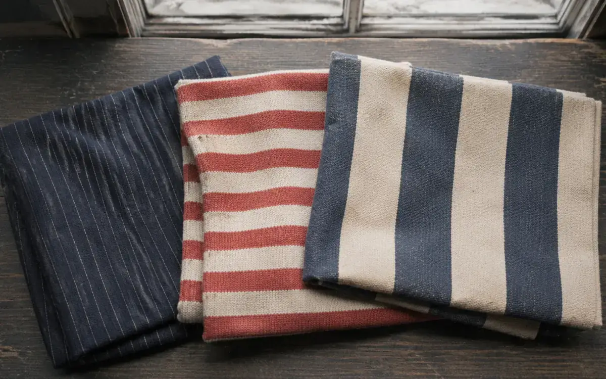
Stripes are back for autumn — striped linen shirting, deckchair-width cotton, fine pinstripe tailoring. This happens roughly every eighteen months, and it is always announced as a revival. It isn’t, really. The stripe has never actually left British dressing. It has simply moved between classes, industries and decades, picking up a new set of meanings each time.
Which is more than most patterns manage. A stripe is the simplest mark you can put on cloth, and yet in Britain it has signified disgrace, service, wealth, rebellion and seaside leisure — sometimes within the same century.
The medieval problem with stripes
Stripes started badly. In medieval Europe, striped cloth was associated with people on the margins: jesters, jugglers, prostitutes, convicts, executioners and the mentally ill. Sumptuary laws in several European territories restricted who could wear it, and the pattern carried a genuine social stigma.
The reasoning was partly theological — a striped surface was read as disordered, a cloth that couldn’t decide what it was — and partly practical, in that visible patterning made certain groups easy to identify. Either way, for several hundred years, to be dressed in stripes in Britain was not a compliment.
The Navy rehabilitates it
The stripe’s reputation was rescued, more or less, by the sea.
By the eighteenth century, striped fabrics were common in nautical dress across the Channel and the Atlantic, and the association with sailors gradually pulled the pattern towards ideas of service, discipline and open air rather than disgrace. Practicality helped: a striped man overboard is easier to spot in grey water than a plain one.
The most famous version of this is French rather than British — the Breton, with its regulation stripe count, adopted by the French Navy in 1858. But Britain absorbed it enthusiastically, and by the early twentieth century the horizontal navy-and-cream stripe had crossed from working dress into holiday wear, and from there into the wardrobe of every art student in the country.
The pinstripe and the City
While the horizontal stripe was going to sea, the vertical one was going into an office.
The pinstripe became a fixture of the City of London in the nineteenth and early twentieth centuries, and the traditional explanation — that different banking houses used different stripe widths to identify their staff — is more folklore than documented fact. What’s not in dispute is the effect. A narrow vertical line on dark worsted cloth lengthens the body, sharpens the silhouette and photographs with authority. It became the visual shorthand for British financial power, and by the 1980s the shorthand had hardened into caricature.
That caricature is why the pinstripe spent much of the 2000s in exile. Its return now is deliberately loosened — softer cloths, wider chalk stripes, relaxed cuts, and very often worn by people with no connection to a trading floor whatsoever.
The deckchair, the awning and the seaside
There’s a third British stripe, and it’s the one currently doing the most work on the high street: the broad, saturated stripe of the deckchair and the shop awning.
British seaside culture built an entire visual language out of bold vertical stripes — deckchairs, windbreaks, beach huts, Punch and Judy booths, rock. It’s cheerful, slightly nostalgic and completely unpretentious, and when fashion wants to signal ease rather than status, this is the stripe it reaches for. The current run of wide-stripe linen shirts and oversized striped cotton is drawing directly on it.
Punk, mods and the subversive stripe
The stripe’s disreputable origins never entirely went away, and British subcultures kept finding uses for them.
Mod tailoring in the 1960s used fine stripes to sharpen an already sharp silhouette. Punk in the 1970s took the stripe in the opposite direction — mohair jumpers, striped tights, torn horizontal knits — reclaiming exactly the chaotic, disordered quality that medieval Europe had objected to. Vivienne Westwood, more than anyone, understood that a stripe could be made to look like a threat.
That tension is still what makes the pattern interesting. The same mark can read as a bank manager or a Camden squat depending on width, colour and context.
How the rules actually work
The received wisdom — vertical stripes lengthen, horizontal stripes widen — is only partly true, and it depends far more on the width and spacing of the stripe than its direction. Fine, closely spaced stripes of any orientation tend to blur into a texture at distance. Wide, high-contrast stripes hold their shape and draw attention to whatever they’re crossing.
The more useful rules are simpler:
- Contrast controls volume. Navy on cream shouts. Navy on charcoal whispers.
- Width sets the register. Fine equals formal. Broad equals leisure. There’s very little middle ground.
- One stripe at a time, unless you’re deliberately mixing widths — in which case make the difference obvious rather than marginal.
Why it keeps coming back
The stripe endures because it’s the most legible pattern there is. It needs no explanation, it survives being scaled up or down, it works in two colours or twelve, and it carries several centuries of accumulated meaning that anyone can read without being told.
So when the striped linen shirt reappears this autumn, it isn’t a revival. It’s just the same pattern taking another turn — from the gallows to the galley to the trading floor to the beach, and now onto a rail in Marylebone. Give it eighteen months and it will mean something slightly different again.